Survey of Computer Art Applications - Spring 2010
Taught by Associate Professor, Darrell Kincer, this course was an introduction to Adobe Photoshop and Illustrator. At the time I suffered with Photoshop, but I excelled with Illustrator's Pen Tool.
Adobe Illustrator: Pen Tool Project
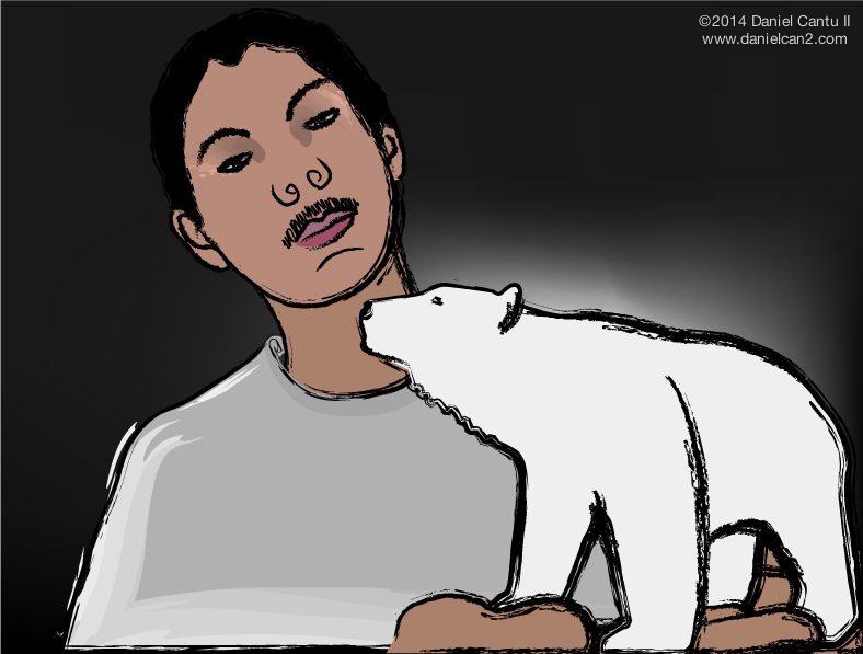
This project involved recreating a self-portrait image with the Adobe Illustrator's Pen-Tool. This is the reference self-portrait used in the Adobe Illustrator: Pen-Tool Project. The papercraft polar bear in my hand was a Christmas gift I made for a professor.
Adobe Photoshop: Composite Art
This project involved using Adobe Photoshop to merge three different mediums (paper image, digital image, and real-world object) into one final product. The red character on the left is an image from a poster, the blue character is a digital image from the Avatar movie, and the background design is a photo-scan of the bottom of my Tony Hawk shoe.
Adobe Illustrator: Logo Design
This project involved using Adobe Illustrator to design three different logos for my name. This is technically an ongoing project, since I have tried creating different name-logos for years to no avail.
Adobe Illustrator: Number Design
This project involved using two selected numbers and giving them a unique design. Out of the numbers from 1 to 20, I chose 7 and 17.
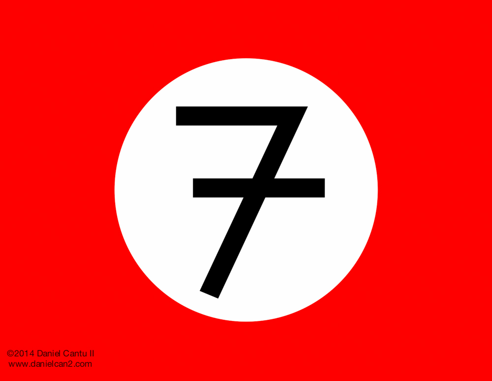
I designed the 7 as a European 7, which has a slash through it because their 1 looks like a 7, so they have to use a slash to distinguish the two. Since I used to live in Germany and this is how they wrote, I designed the background to represent the German regime that once plagued Europe.
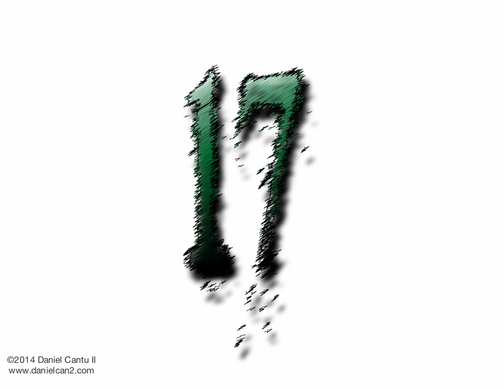
For the 17, I used various filters and effects to design this the number, some of which were gradients, twisted-stroke filters, and drop-shadows.
Adobe Illustrator: Brand Design
This project involved creating a fictional brand's logo and applying it to promotional material. My fictional brand was called "It Burns So Good, Inc." The fictional company would be a graphics design business. The background design is an eagle and snake from the Mexican Flag, trace from an internet image.
The first design was a business card. The four squares represent a color spectrum that coincides with graphic designs. The eagle represents hispanic heritage.
The next design was a postcard, which has a front and back design.
The last designs were a circular beverage coaster and a matchstick case cover.


